

⌦ UX UI Case Study: The Cleveland Museum of Art Tour Guide App
INTRO
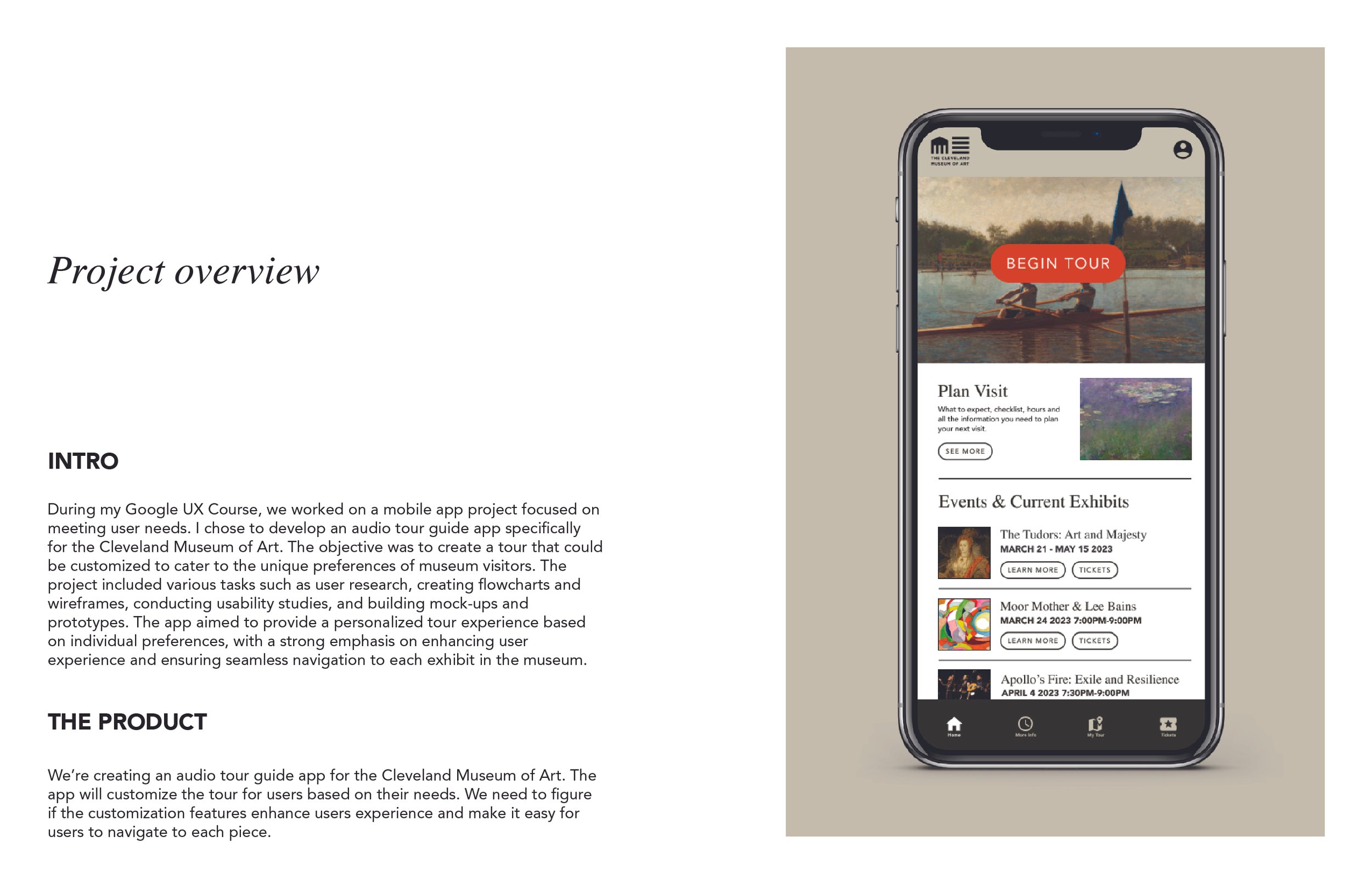
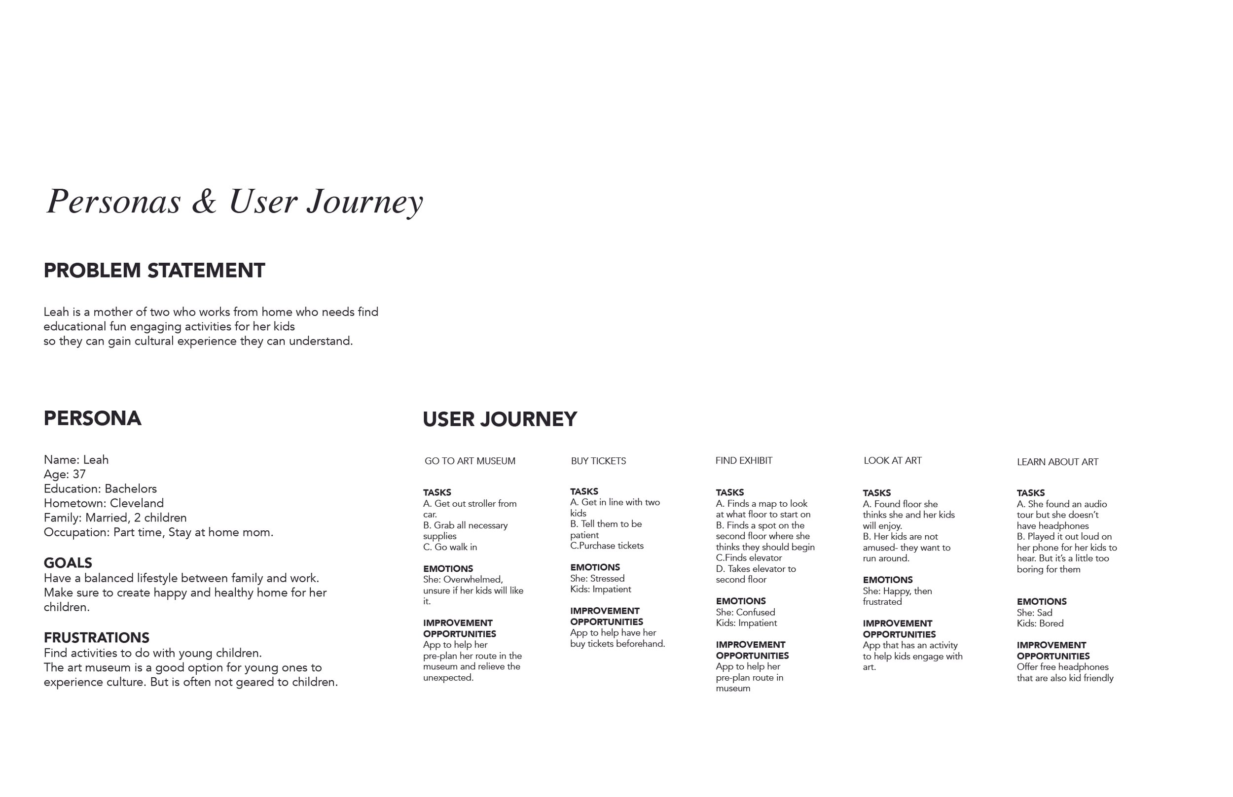
During my Google UX Course, we worked on a mobile app project focused on meeting user needs. I chose to develop an audio tour guide app specifically for the Cleveland Museum of Art. The objective was to create a tour that could be customized to cater to the unique preferences of museum visitors. The project included various tasks such as user research, creating flowcharts and wireframes, conducting usability studies, and building mock-ups and prototypes. The app aimed to provide a personalized tour experience based on individual preferences, with a strong emphasis on enhancing user experience and ensuring seamless navigation to each exhibit in the museum.
ROLE
Visual Identity
UX/UI Designer
Case Study


Wireframing & Lo Fidelity Mock-ups
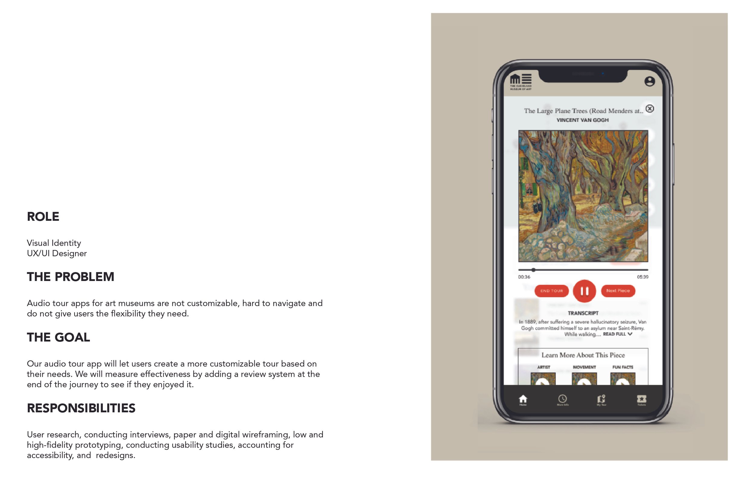
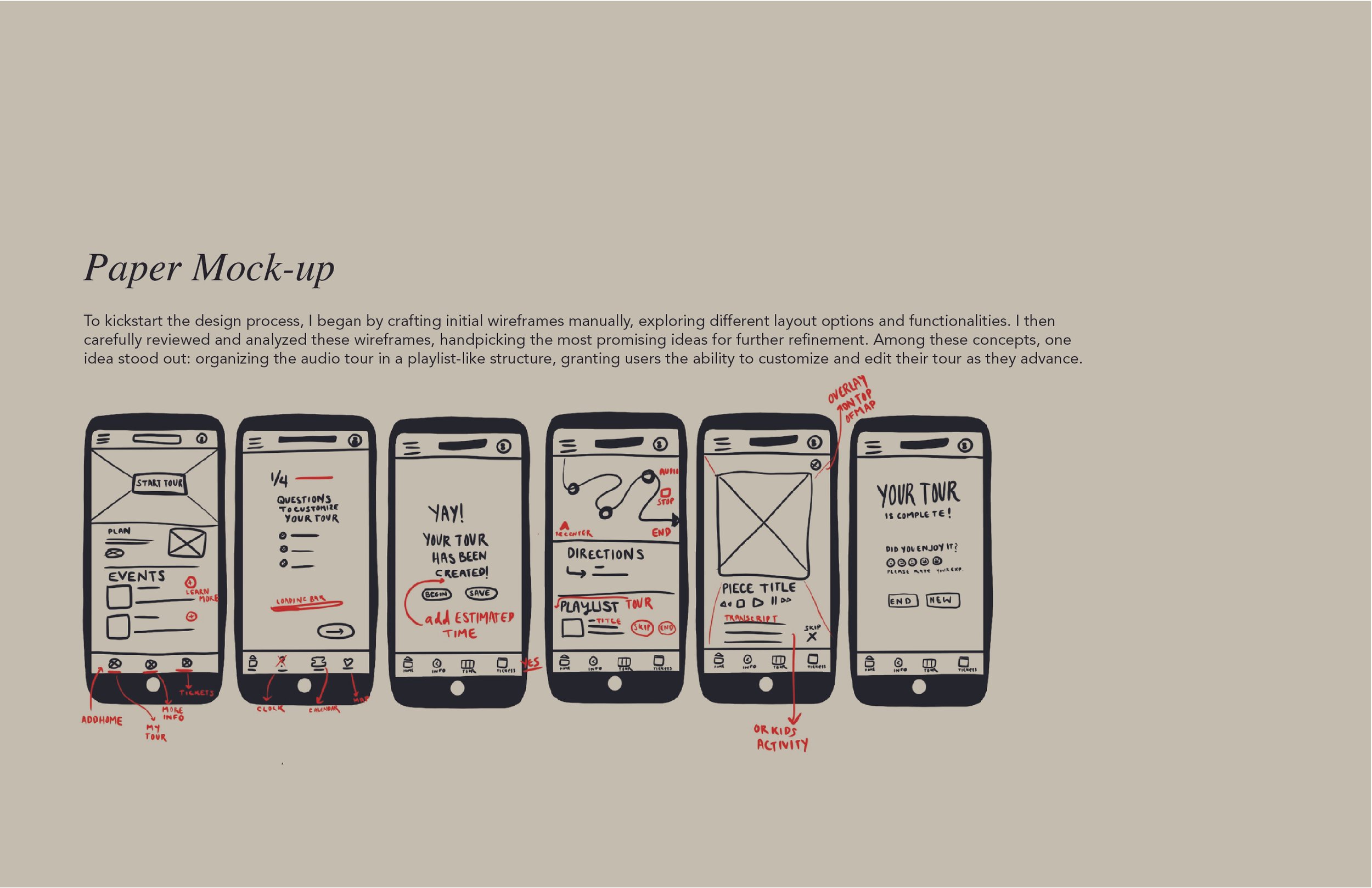
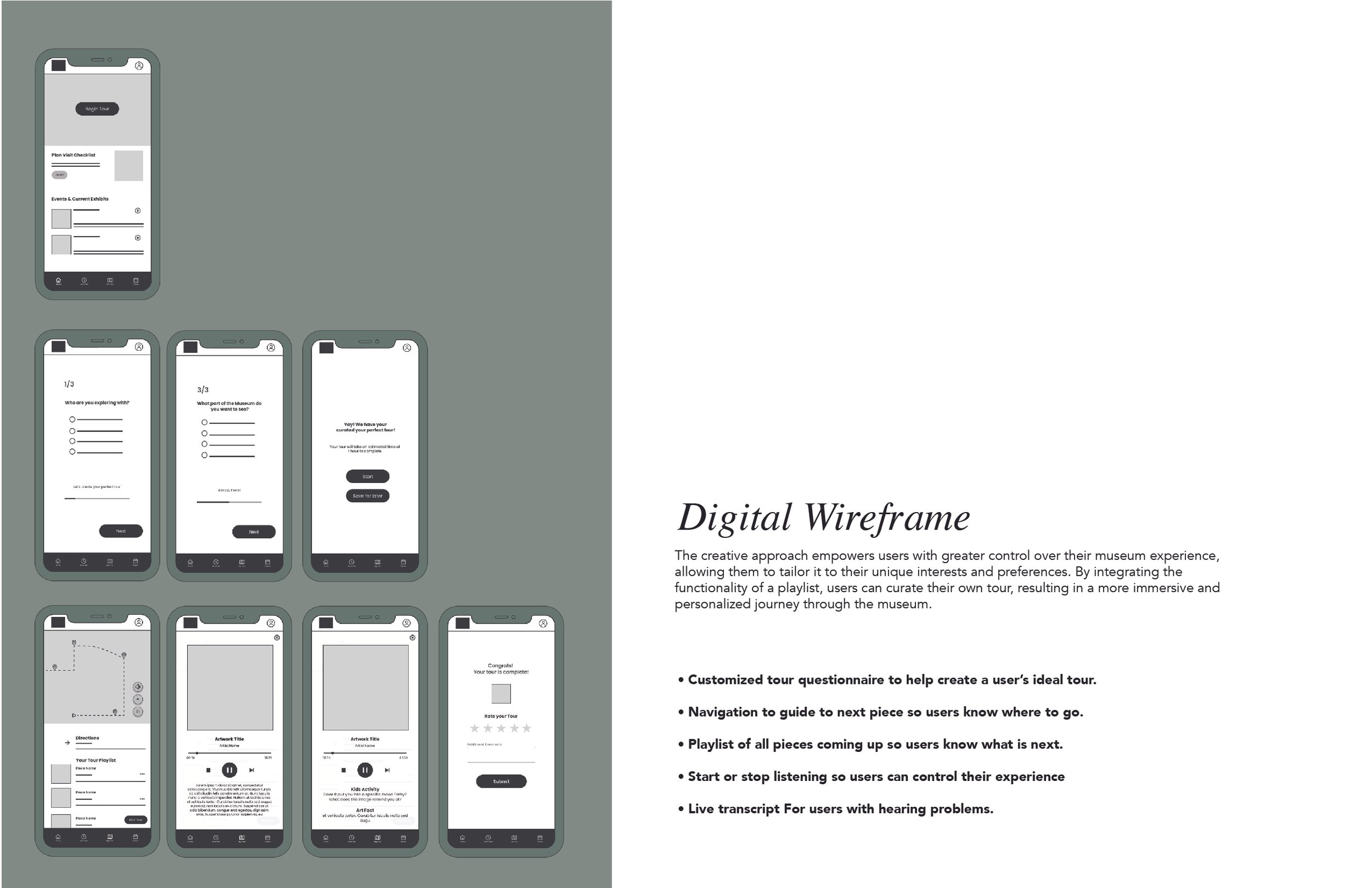
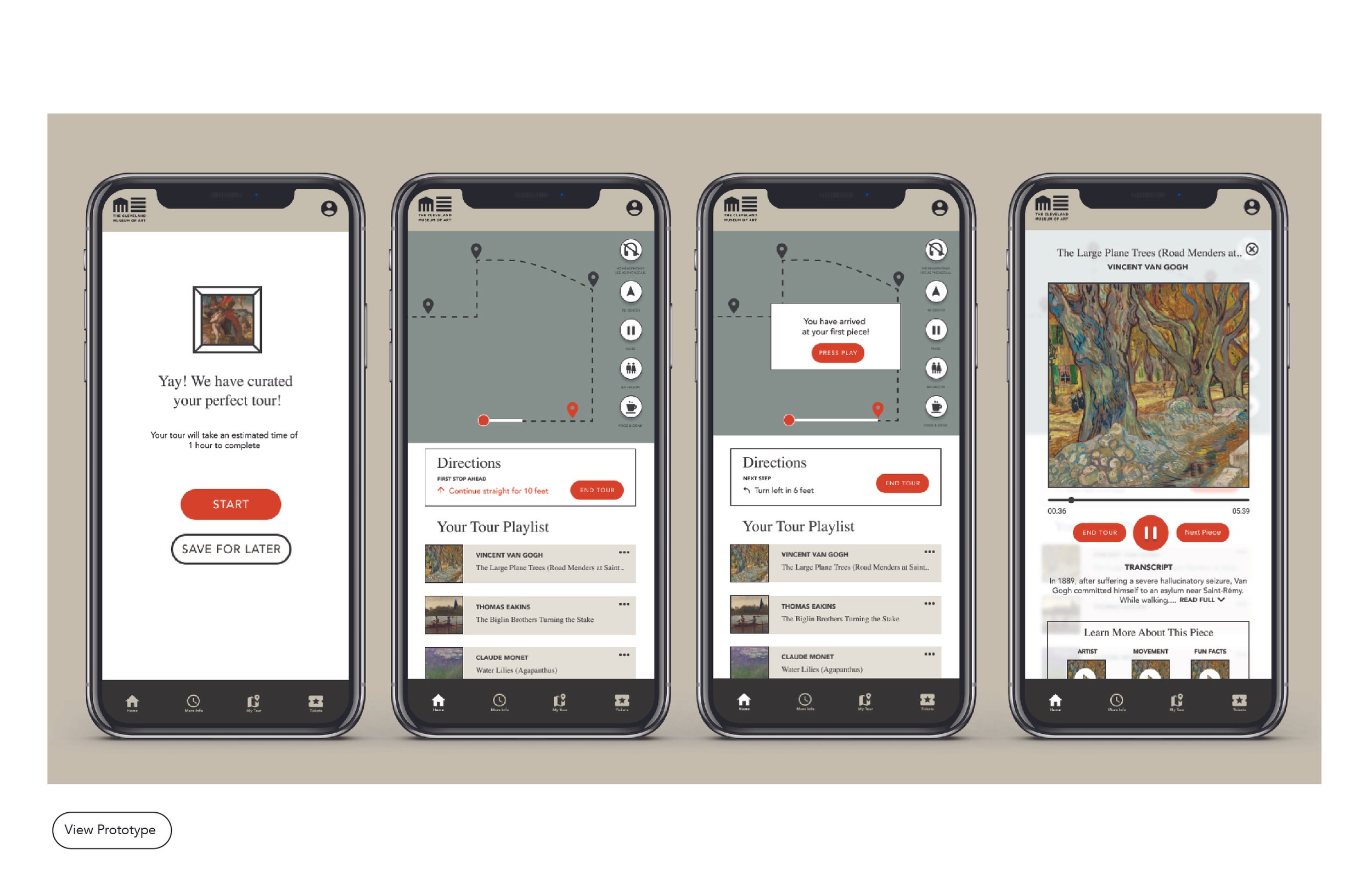
To kickstart the design process, I began by crafting initial wireframes manually, exploring different layout options and functionalities. I then carefully reviewed and analyzed these wireframes, handpicking the most promising ideas for further refinement. Among these concepts, one idea stood out: organizing the audio tour in a playlist-like structure, granting users the ability to customize and edit their tour as they advance.
This creative approach empowers users with greater control over their museum experience, allowing them to tailor it to their unique interests and preferences. By integrating the functionality of a playlist, users can curate their own tour, resulting in a more immersive and personalized journey through the museum.


Color & Type
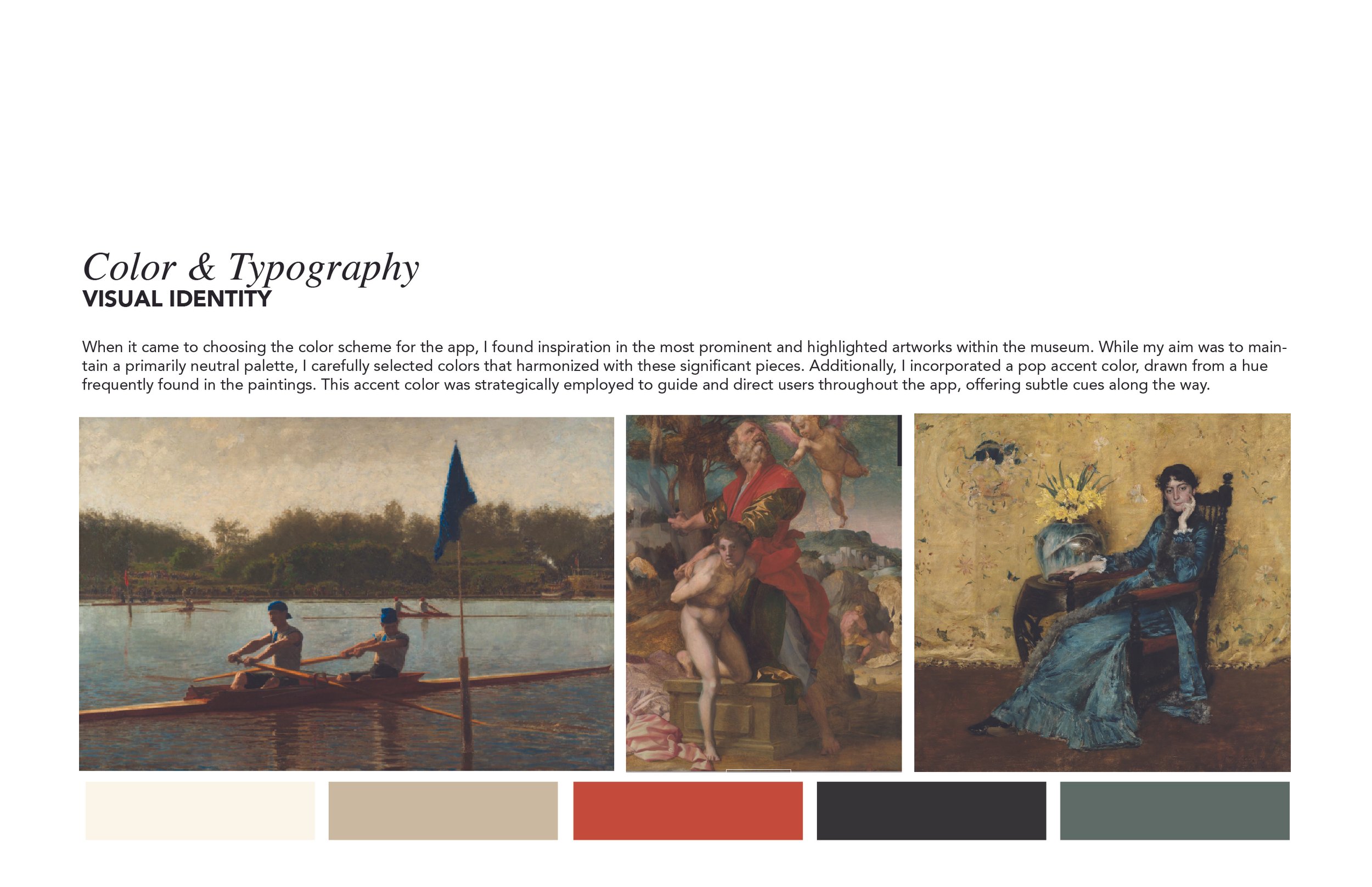
When it came to choosing the color scheme for the app, I found inspiration in the most prominent and highlighted artworks within the museum. While my aim was to maintain a primarily neutral palette, I carefully selected colors that harmonized with these significant pieces. Additionally, I incorporated a pop accent color, drawn from a hue frequently found in the paintings. This accent color was strategically employed to guide and direct users throughout the app, offering subtle cues along the way.
Regarding typography, I strived to strike a balance between timeless aesthetics and legibility. For all headers, I opted for the classic serif font, Times, which added a touch of elegance. For smaller text and information, I chose a clean and easily readable sans-serif typeface, enhancing legibility and usability across the app.

